Highlights
-
Full brand development delivered
-
Positive feedback from key stakeholders
-
Refreshed brand identity
Brand evolution for a third-sector organisation
Enhancing the logo and visual identity of a well-established third-sector organisation deeply rooted in the local community. This transformation involved close collaboration with key stakeholders to ensure alignment with the organisation's values and mission.
Challenges
Galloway's, a well-established sight loss charity, has been providing essential support services to people affected by sight loss in the North West of England for more than 150 years. They have established a rich history and a firm place within the Lancashire and Sefton communities, and while their current brand has served them well, there was a sense that it didn’t align with their position and aspirations for the future.
We stepped in to rebrand Galloway’s and establish a future-proofed identity that their target audiences could resonate more strongly with.
Solution
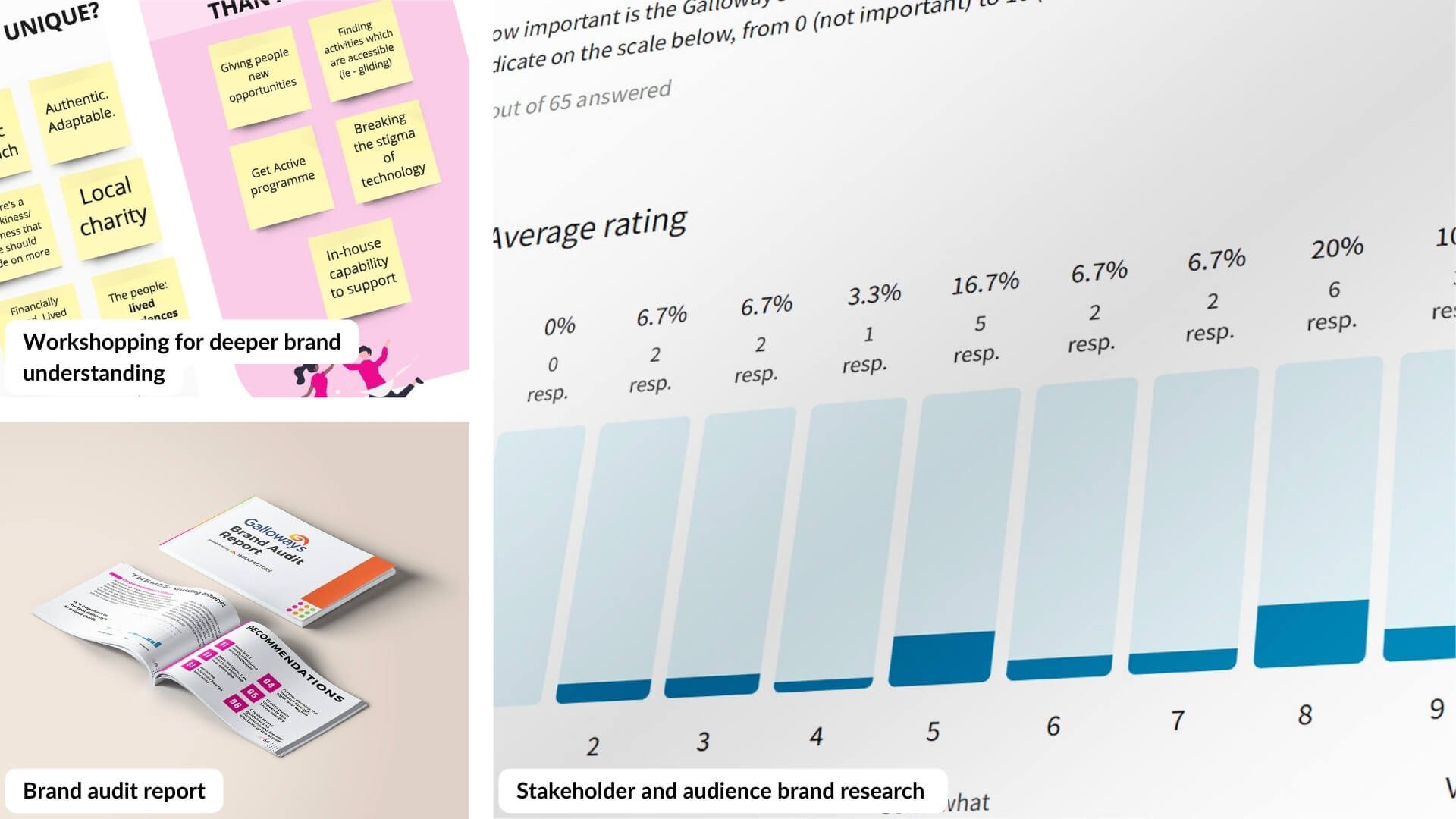
As with all rebrand projects, we began with research. In order to gain an in-depth understanding of Galloway’s and their impact on the communities around them, we conducted two workshops with their core audiences: local people affected by sight loss as well as their colleagues and volunteers. The aim of these workshops was to uncover narratives, thoughts, feelings, language, and symbolism surrounding Galloway’s.
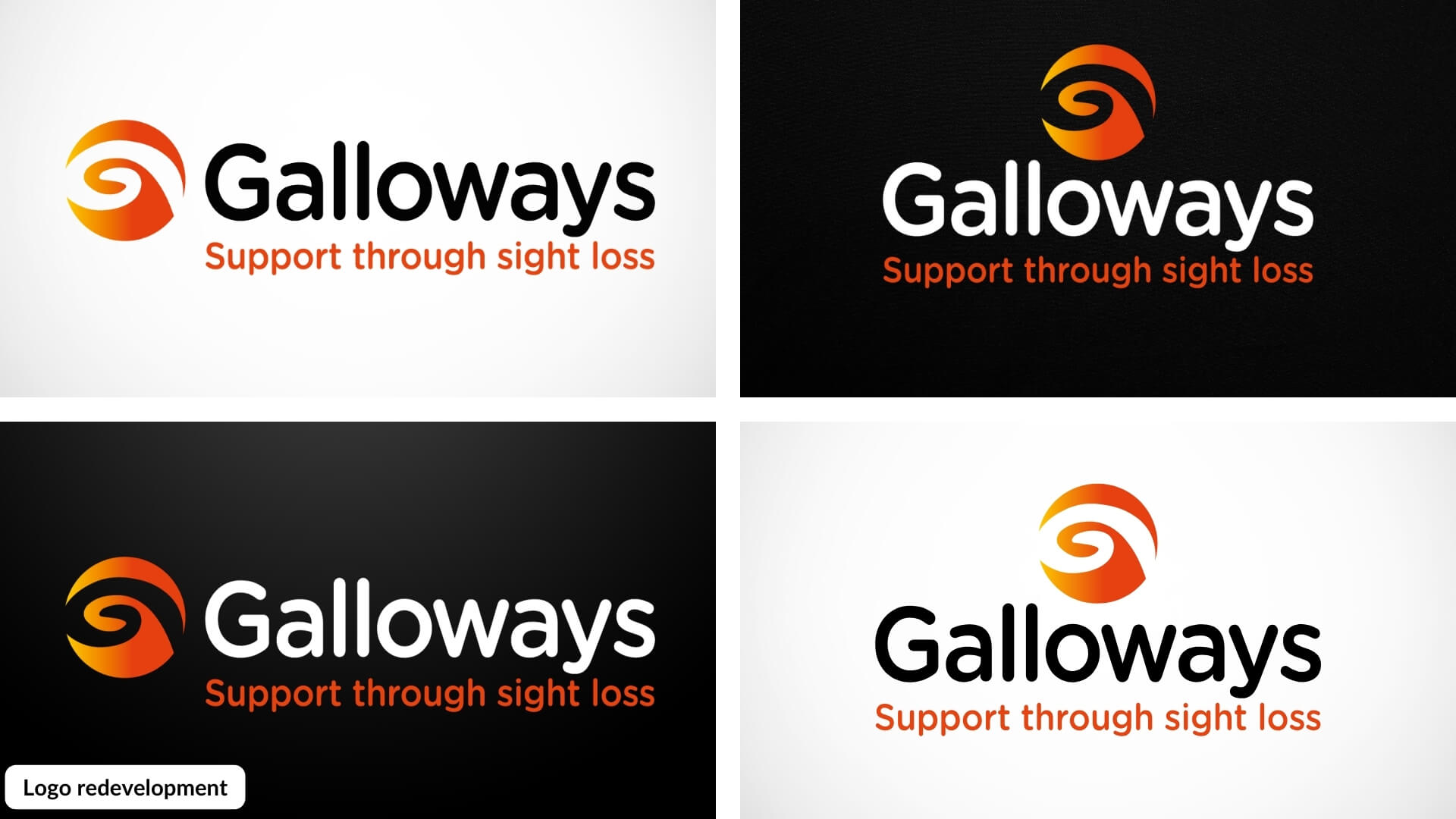
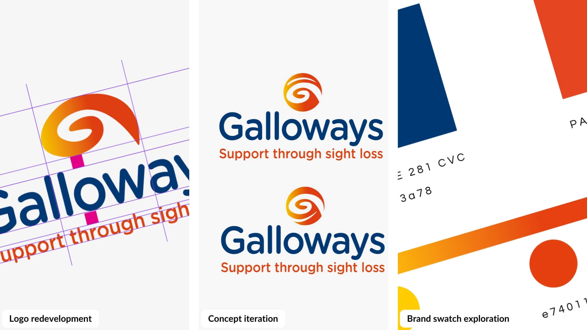
We supplemented these workshops with a brand audit and marketplace snapshot to identify the strengths and weaknesses of the brand. With this solid basis to start from, we worked on enhancing their visual identity, revamping the logo to better reflect theGalloway's brand retaining the strong elements identified as crucial in the audit.
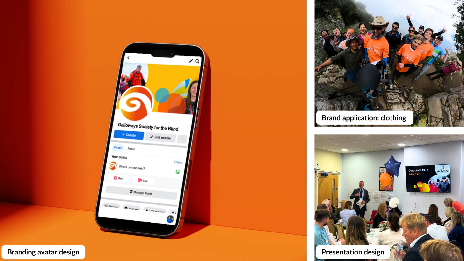
With their new identity created, we produced brand kits, including stationery, posters, flyer templates, email signatures, social share templates and presentation templates. To reinforce brand consistency and ensure a clear identity, we developed clear and concise brand guidelines. The guidelines were also created and designed with larger fonts to accommodate individuals with visual impairments.
Impact
The brand evolution has garnered an overwhelmingly positive response from Galloway’s team and its service users. It’s allowed Galloway’s to really capitalise on a stronger digital presence and futureproofed their digital marketing potential.
We have received feedback from Galloway's indicating that the updated designs are more compelling and effective in digital formats. The involvement of both service users and team members throughout the rebranding project has resulted in a greater sense of unity within Galloway's, and has reinforced their shared values and aspirations.
They now have a refreshed brand identity that accurately reflects who they are and one that everyone can rally around.
.jpg)

We are agents of change. We make things different through branding, strategy, process and communication.
